Simulating the Six Nations 2019 Rugby Tournament in R
I really like running simulation models before sporting events because they can give you so much more depth of understanding compared to the ‘raw’ odds that you get from the media or bookmakers, etc. Yes, a team might have a “30% chance of winning a tournament we might hear”. But there might be another strong team in the tournament might be 25% likely to win. Then there’s that plucky underdog team who are only 2% likely to win the tournament, but have a fair chance of causing at least one team an upset. Not to mention home/away advantage, competition points, and structure, etc.
That’s where a simulation can provide a lot of extra oompf for a little extra effort. If we can take the ‘raw’ odds but then add in some volatility then we can understand the distribution of outcomes.
That being said, with the Six Nations 2019 officially starting this weekend with France playing Wales on Friday, I thought I’d best run a simulation model. I do apologise in advance as it’s a little bit hastily put together as I have not had a huge amount of time and wanted to complete a simulation before the competition starts in a few hours time. But nevertheless I hope it can provide some insight into both the tournament and also more generally how to simulate a sporting competition!
Rating Data – How good is a team? Given that, how likely is team A to beat team B?
I used rating data from the Rugby Pass Index to calculate the probability of team A beating team B for every fixture in the Six Nations. This was done using a formula that considers the difference in ratings between the two teams and also gives a home advantage boost to the home team.

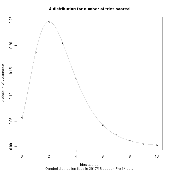
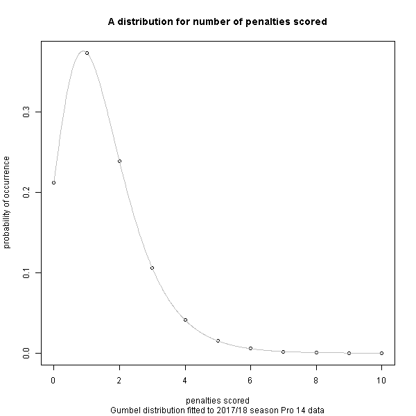
The favourite team doesn’t always win – how much leeway for luck is there? We need a Distribution for Points Scored in a Rugby Match.
In a game like soccer, you get a lot of draws because goals don’t happen very often, at least compared to rugby where it’s not unusual to see 60pts or more scored per team. What does a distribution of points look like? Therefore how much leeway is there for a ‘better’ team to ‘choke’ and not score the tries, conversions and penalties needed to get the winning score, and how much leeway is there for the ‘underdog’ team to ‘get lucky’ and nail their tries, conversion and penalties needed to get the winning score?
If we can define this then combined with the ‘raw’ probability of winning we can take random samples of it during multiple simulations to understand the distribution and volatility of outcomes.
For the general probability distribution of occurrence of tries scored, conversions given a try has been scored, and penalties scored, a fitted distribution from the 2017/18 season of the Pro 14 league has been used because I already had it to hand (and I hope to document this in another post). Given more time, I would use Six Nations data as the distribution might be slightly different in high-pressure international matches compared to the Pro 14 league. Nevertheless, I think it the Pro 14 data is worthy for use for a quick model.
Now that we have the probability of winning, and can randomly sample from the distribution of points scored, we are in business.
For each match simulation, a random sample of the probability distribution on tries, conversions, and tries scored was taken and essentially multiplied by the probability of winning for each team. The competition points (win 4pt, draw 2pt, lose 0pt; 4 tries or more bonus point; losing by 7pt or less bonus point) were then calculated for each team in that match. For each tournament simulation, the results were recorded and the tournament was simulated again, until we got 10,000 simulated tournament results.
Finally, we can plot and analyse the results.

No surprise really that Ireland had the most tournament wins. The order follows the Rugby Pass Index rating. For a competition like the Six Nations where the most major factor is who are you playing at home (and hence gaining that all important home advantage), this is to be expected. For something like a World Cup where group stages are involved, this would be a lot less straightforward.
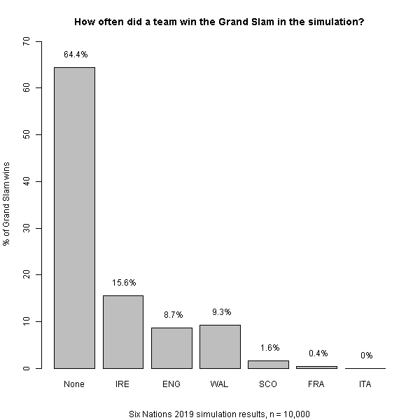
In the Six Nations, winning all of your matches get you the Grand Slam in addition to the Six Nations tournament victory, thus bringing further glory to your nation! It looks like it’s a fairly large ask this year. For Ireland who are clear tournament favourites, their odds of a Grand Slam victory are somewhat reduced due to the probability of being beaten by any one of the other five nations in the process – in particular England or Wales.
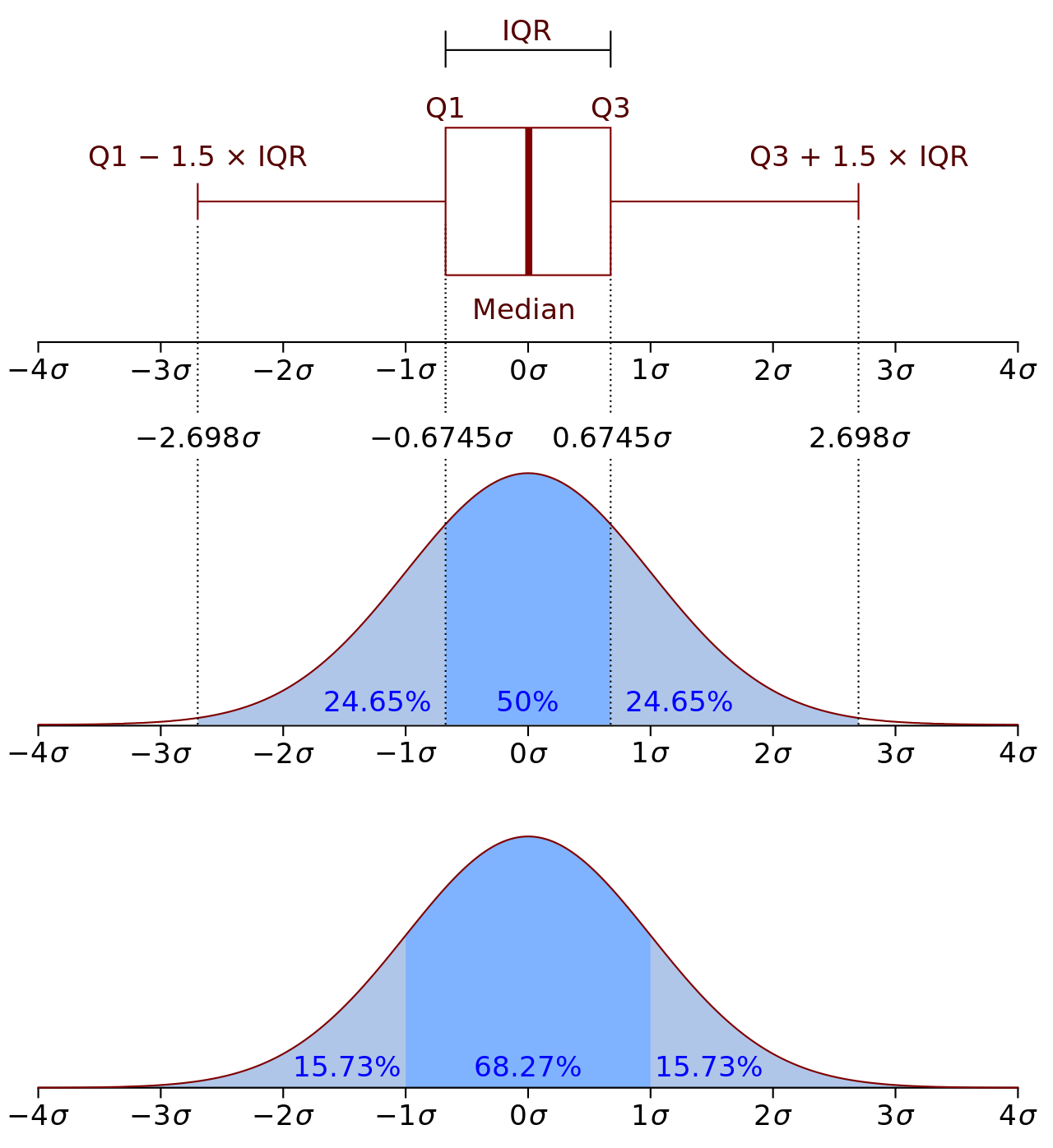
Before we look at the box plots from the simulation – I’ve included this summary of what a box plot is from Wikipedia. The box is showing 25th-75th percentile outcomes, and the thick line the 50% percentile (aka median). The whiskers either side of the box usually end up somewhere in the ballpark of the 10th and 90th percentiles. Circles are then used to show occurrences outside the whiskers.
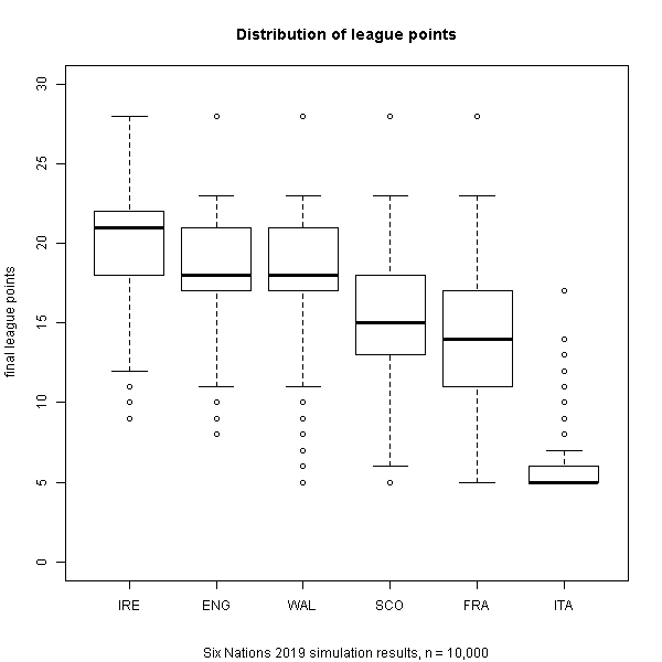
The order remains when we look at the distribution of points – again no surprise. We can now see that Italy are clear contenders for the wooden spoon.
Italy, by far the worst team, don’t really ever seem to get less than 5 points. This could point to a deficiency in the model, perhaps in the distributions – which I will look to address at a later date.
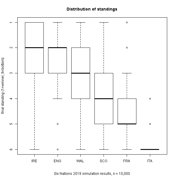
Finally, what does the distribution of standings look like? Based on the simulation results, Ireland will reliably be in the top 3. Although you might be tempted to think that according to this, they also have a fair chance of finishing bottom – this is incorrect and is due to the Inter-Quartile Range spanning 2pt – this behaviour is also observed for Wales and Scotland – I’ll may revise the visualisation in an update later. England reliably ought to finish 2nd or 3rd but with a fair possibility of winning or finishing 4th. Wales, a similar story but likely to be one place lower. Scotland and France are likely to battle it out for 4th/5th. Poor Italy once again are very much expected to win the ‘wooden spoon’.
Well, I hope you enjoyed this as much as I did. The simulation code is available via Git here.